
Project Overview: Awakening the Night-Seer
Showbean Coffee is a dynamic specialty coffee roaster and beverage brand built for coffee enthusiasts seeking premium quality beans without unreasonable price tags. In a market saturated with monotonous brown palettes and predictable coffee cup icons, Showbean sought a bold, memorable visual presence that radiates warmth, joy, and uncompromising character. The name “Showbean” carries deep poetic roots in Persian, translating to “the one who sees through the night.” Our objective was to translate this cultural essence into a clean, modern lifestyle brand that feels both approachable and distinct.
The Strategic Challenge: Escaping Industry Monotony
Most coffee brands rely heavily on dark, serious, or artisanal vintage aesthetics that often feel unapproachable. The challenge was to craft an identity that balances high-grade coffee credibility with an infectious, uplifting mood. Furthermore, because Showbean curates six distinct coffee bean profiles (varying in roast levels and regional origin), the branding needed a cohesive visual architecture capable of categorizing each flavor note without breaking brand recognition.
The Creative Solution & Design Methodology
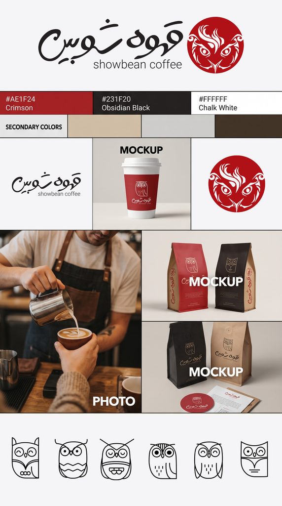
We anchored the primary mark in a seamless fusion of two core elements: the watchful owl (symbolizing nighttime clarity and energy) and the fluid, organic swirls of latte art. The central emblem captures an owl’s face crafted entirely from creamy micro-foam patterns within a circular badge. To accompany this mark, we drew a custom organic Persian logotype that flows with warmth and effortless rhythm, balanced by clean modern English typography.
To solve the multi-product categorization challenge, we illustrated six custom minimalist owl mascots with distinct facial expressions and personalities. Each mascot represents one specific coffee line, bringing an engaging storytelling dimension to the packaging, in-store menus, and digital touchpoints.
Impact & Execution
The resulting identity spans an end-to-end ecosystem: from tactile packaging and high-contrast promotional posters to a responsive eCommerce website. Dominated by a bold crimson red (#AE1F24), deep obsidian (#231F20), and chalk white (#FFFFFF), the visual identity positions Showbean Coffee as an accessible, high-energy coffee brand that sparks genuine joy with every cup.